If you can more or less recognize the classic fonts, with all the loops in the right places, you are probably ready to have a go at recognizing the more stylish, minimalistic modern fonts.
 |
 |
Modern Fonts are actually quite easy to read, once you get used to them.
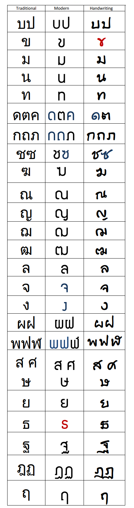
Please download this PDF handout to see how the fonts differ (or not, as the case may be).
Most of the letters are the same, with bulges or blobs where the loops (heads) were. And if something isn’t important then it’s simply left out. For example, ม and น and ห don’t bother with the “head” (the loop on the top left). The main distinguishing factor is where the loop changes – e.g., for ม it’s on the bottom left, for น it’s on the bottom right, for ห it’s on the top right.
You’ll get to recognize these very quickly. Sometimes if you’re not sure about a particular letter because it could one of two possibilities (e.g. the ด letter, which could be either ด or ถ in a modern font) then you might have to find another example of the letter, or its counterpart, in the text (hopefully it’s a long enough text to contain more than on example of the same letter).
Sometimes you’ll see a word you recognize, it becomes a ‘sight word’ – and by a process of deduction you’ll figure out what the letter is. It takes a bit of practice, but after a while you’ll find that the modern fonts are actually easier to read. They’re cleaner and have fewer distracting lines and loops than the classic fonts.
Obviously, it also helps to have some vocabulary so that you can more or less guess what the word is likely to be from the context.
Attached is the hand-out that identifies the differences that you do need to know in order to be able to read the modern fonts. The letters in black are easily recognizable in the modern fonts, so just focus on the red and blue letters.
- The traditional fonts are in the left column. The next columns are the modern & handwritten forms. All that has happened is that the unimportant bits of the letter are left out, usually the extraneous loops. If you look at the 3rd & 4th letters down (ม and น) you’ll notice that the essential difference between these is the loop at the bottom is either on the left of the right. So the loop on the top left can be discarded. No other letters looks like these, so it’s safe to do so.
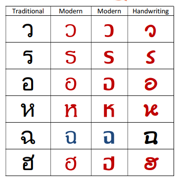
- Sometimes the ห looks more like a K than an H or h. But if you think of the K as a kind of h but with the dash (representing the ‘baby’ of the hump-backed mother) then it’s easier to recognize.
- Another potentially confusing letter is the ข (cackling old witch). It’s often just a skinnier version of บ or sometimes a kind of lazy V. But it can also sometimes look like a cursive X
 . If you write it very fast and lazily, the curl of her neck can easily intersect and become like an .
 - The ช and ซ are often quite difficult to distinguish, either from the regular ข or from each other because the dent of the ‘chop’ is often very slight, and the dent in the ‘slice-and-dice’ neck is usually a hint of a curve, no more.
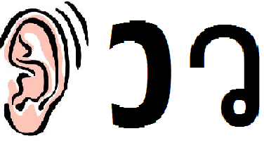
- Some letters look quite different – and I’ve highlighted them in red. Some are only slightly different – and these are in blue. The blue ones just need to be noted and you’ll recognize them easily. The red ones can be understood when you know how Thai letters are written. They start from the main loop. So the letter ว is written starting from the loop at the bottom. In English, we’d normally write it starting from the other end. Try writing it the Thai way. Now write it again, but very fast. And again, dropping the loop. And again. Notice that it starts to look like a lazy backwards “C”.
So you could maybe think of it as a backwards WC or
.png) , which is how wiggly ladyboys use the lavatory anyway!
, which is how wiggly ladyboys use the lavatory anyway!Another way to think of this is simply to “see” a different picture that represents the same sound (W) – the “wiggly” ear of a cartoon face…!
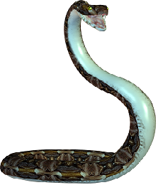
- Remember, all Thai letters are written starting from the loop. So what looks like an “S” is actually the ร written very quickly from the bottom, which eventually looks like our “S”. Think of a Snake Rearing its head to give you the “r” letter.
- The backwards “G” is actually the อ written quickly or stylistically. Very often, you will see it simply as an “O”.
- Finally, the “U” is simply the u-boat บ and the upside down “U” is the male chicken in the sky without its beak ก.
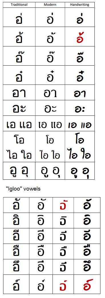
As for the vowels, these are mostly the same except for the following potential ambiguities:
- The ‘igloo’ vowels are fairly obvious: either a single horizontal dash for the “igloo”, a horizontal dash and a vertical line on the right for ‘chiminey’, two vertical lines for ‘birdy’ and a blob for ‘burp’. However, the ‘puppy/pizza topping’ has the vertical line or curve on the left.
- The ‘surfer’ tone mark and ‘puppy’ vowel can sometimes look the same. Keep in mind that the ‘surfer’ tone mark is actually a zig-zaggy character like a “Z” (actually the number “2”), whereas the ‘puppy’ is at most a slighly concave horizontal line.
- The เ and แ vowels are quite obvious, but often appear as two vertical lines, | or ||. And the ‘end-puppies’ ะ often appear as two dots like a colon :
Once you’ve become familiar with the ‘classic’ style of the letters, you’ll notice that It’s only a few letters that look ‘different’; the rest are more or less obvious.
Print out the handout (above) for reference and then see if you can make out the following signs:
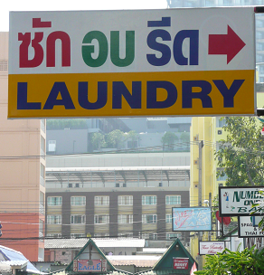 |
ซัก อบ รีด | |
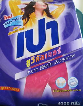 |
เปา
ยูวีคัลเลอร์ สะอาด สีสดใจ เพือสุขภาพ 4000 กรัม |
|
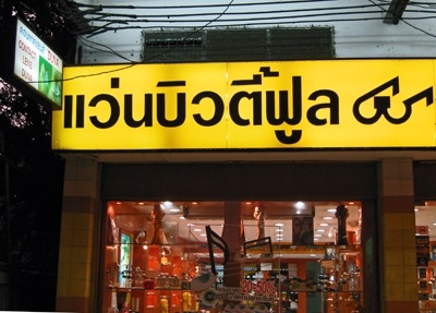 |
แว่นบิวตี้ฟูล | |
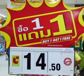 |
ซื้อ 1 แถม 1 | |
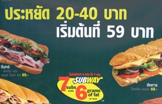 |
ประหยัด 20-40 บาท
เริ่มต้นที่ 59 บาท |