Modern Fonts
As for the modern fonts, if you can more or less recognize the classic fonts, with all the loops in the right places, you are probably ready to have a go at recognizing the more stylish, minimalistic modern fonts.
Most of the letters are the same, with bulges or blobs where the loops (heads) were. And if something isn’t important then it’s simply left out. For example, ม and น and ห don’t bother with the “head” (the loop on the top left). The main distinguishing factor is where the loop changes – e.g., for ม it’s on the bottom left, for น it’s on the bottom right, for ห it’s on the top right.
You’ll get to recognize these very quickly. Sometimes if you’re not sure about a particular letter because it could be one of two possibilities (e.g. the ด letter, which could be either ด or ถ in a modern font) then you might have to find another example of the letter, or its counterpart, in the text (hopefully it’s a long enough text to contain more than one example of the same letter).
Sometimes you’ll see a word you recognize – and by a process of deduction you’ll figure out what the letter is. It takes a bit of practice, but after a while you’ll find that the modern fonts are actually easier to read. They’re cleaner and have fewer distracting lines and loops than the classic fonts.
Obviously, it also helps to have some vocabulary so that you can more or less guess what the word is likely to be from the context.
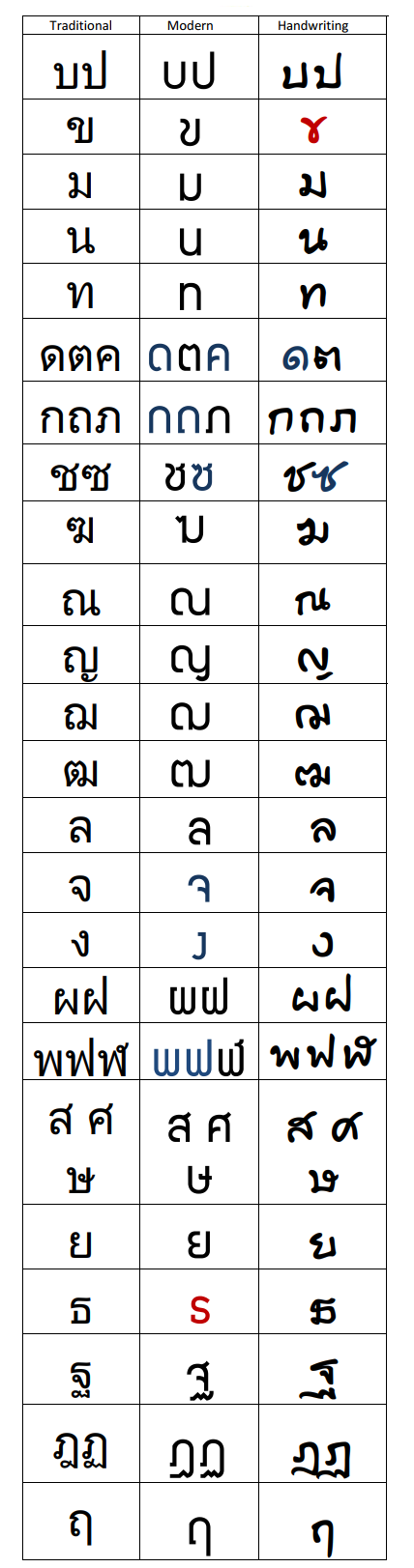
Below is a table that identifies the differences that you do need to know in order to be able to read the modern fonts. The letters in black are easily recognizable in the modern fonts, so just focus on the red and blue letters.
Consonants
(For “snaggle-tooth” letter ธ refer to “rolling” ร below…)
The traditional fonts are in the left column. The next columns are the modern & handwritten forms. All that has happened is that the unimportant bits of the letter are left out, usually the extraneous loops. If you look at the 3rd & 4th letters down (ม and น) you’ll notice that the essential difference between these is the loop at the bottom is either on the left of the right. So the loop on the top left can be discarded. No other letters looks like these, so it’s safe to do so.
No![]() te that when the “push” letter has no indentation, it defaults to the ladyboy version.
te that when the “push” letter has no indentation, it defaults to the ladyboy version.
Clearly this ![]() is looking inwards, showing that it is the girl version.
is looking inwards, showing that it is the girl version.
Some letters look quite different – and I’ve highlighted them in red. Some are only slightly different – and these are in blue. The blue ones just need to be noted and you’ll recognize them easily.
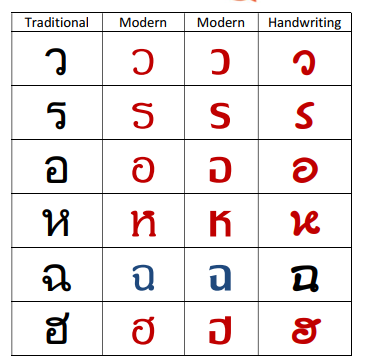
The red ones can be understood when you know how Thai letters are written. They start from the main loop. So the letter ว is written starting from the loop at the bottom. In English, we’d normally write it starting from the other end. Try writing it the Thai way. Now write it again, but very fast. And again, dropping the loop. And again. Notice that it starts to look like a lazy backwards “C”. So a good way to help you get from “c” to “w” is to think of “WC” – but backwards!
But keep in mind that it’s not always “w” – this is a tricky letter because it can be a vowel or a consonant, so make sure to spell out the idea in “long hand” in your mind: The waving ladyboy on her head shouting “ooh aah”… (In fact, even in English, the “w” is treated as a consonant but produced by making the “oo” vowel sound very quickly.)
Remember, all Thai letters are written starting from the loop. So what looks like an “S” is actually the ร written very quickly from the bottom, which eventually looks like our “S”. Think of a snake rearing its head to give you the “r” letter.
The backwards “G” is actually the อ written quickly or stylistically. Very often, you will see it simply as an “O”.
Note: ข is often identical in shape to บ but just a little thinner.
ช and ซ are very similar, it’s sometimes hard to see “slice” (the extra dent).
Finally, the “U” is simply the u-boat บ and the upside down “U” is the male chicken without its beak ก.(
Vowels & Tone Marks
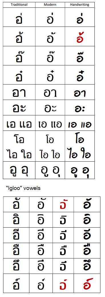
As for the vowels, they’re mostly easily recognizable in any font.
However, there are two or three vowels that are potentially confusing. The modern font for “puppy pizza topping” seems very similar to the “igloo” vowels. But by a process of elimination, it’s the only one that has a stroke or bulge on the left side, while all the “igloo” vowels have some kind of feature on the right (or nothing at all for the plain “igloo” vowel).
Also, the “puppy pizza topping” vowel is sometimes confused with the “surfer” tone mark. Notice that the latter mark is more of a zig-zag, like a “2” or “Z”.
And the “gag duct tape” could also sometimes be confused with the “surfer” tone mark. Notice which way it rolls. Besides, it’s easy to guess from the context that it’s likely to be a silent letter underneath than one with a vowel or tone mark on top.
And that’s it, it’s really that simple!
(BTW, if you haven’t learnt to read with the Rapid Method then you won’t understand my reference to “puppies” or “chickens” or “ladyboys”, etc. in the notes because I’m referring to the terminology I’ve invented for teaching people to read Thai using an accelerated approach. You can still figure out how to recognize the modern fonts from the tables above.)
Bonjour Gary
J’ai appris avec les lettres traditionnelles et j’ai envie de pleurer quand je vois que je dois tout recommencer.
Par contre pour la lettre ฐ et la moderne il n’y a vraiment aucune ressemblance. Que pensent les vieux profs thaï de cette écriture qui n’est vraiment pas belle en plus
Cordialement
JP Rawai
Salut JP,
Merci de l’intérêt que vous portez à ma Rapid Method pour apprendre le thaï.
Il ne sera pas nécessaire de repartir de zero, mais connaître les lettres thaï est la partie la plus simple et la moins importante.
C’est parce que c’est necessaire de comprendre comment les lettres sont utilisées pour épeler des mots; et comment à prononcer ces mots avec précision avec le ton correct.
Pour la letter ฐ, c’est facile: il suffit de faire attention au gribouillis en dessous… elle pêche le thon. 😊
Ouis, je suis d’accord – les polices classiques sont plus belles. Mais les polices modernes sont plus propres et plus faciles à lire!
Cordialement,
Gary
Thanks so much for this. My tutor has me reading headlines and aligning standard script with modern script on websites has been challenging!
Thanks very much, great help.
Very helpful. Thanks!
Amaaing job!
thank you for such a helpful post! I’m just a beginner at Thai and find modern fonts a little bit challenging, this post cleared out most of my confusion. Thanks!!
C’est formidable.
This is so good, but is it me or did you forget ฑ? Thanks 🙏
No, it’s included but only very briefly in passing because it’s virtually obsolete. It’s the same as ท anyway, in every way.